 WidgetCraftGet the app
Color themes
Pink widgets for Android
Rose and blush tones from soft to bold. Pink widgets cover everything from pale blush to hot pink. This recipe uses a blush background, a deep rose text color and a bright pink accent so it stays readable.
Also known as: pink aesthetic widgets, pink theme widgets, rose widgets.
Pink widget recipes
Each recipe has a preview, exact colors and layer-by-layer steps.
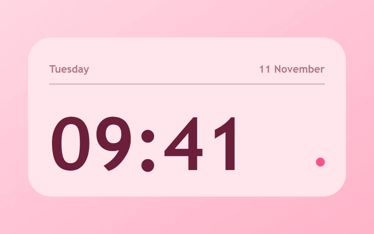 Pink clock widgetFree to build
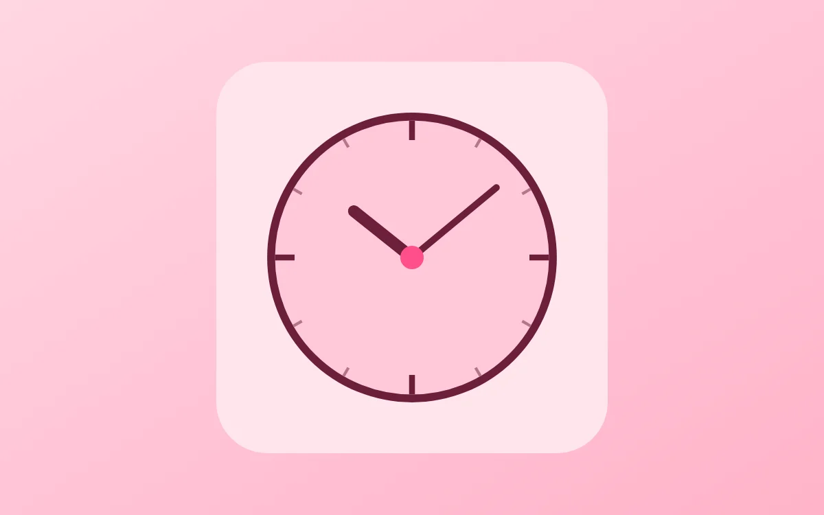 Pink analog clock widgetFree to build
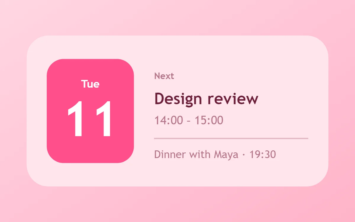 Pink calendar widgetData needs Pro
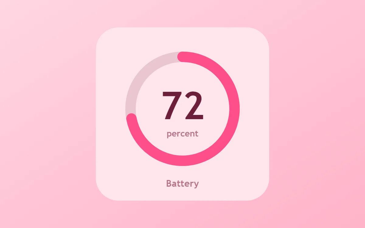 Pink battery widgetFree to build
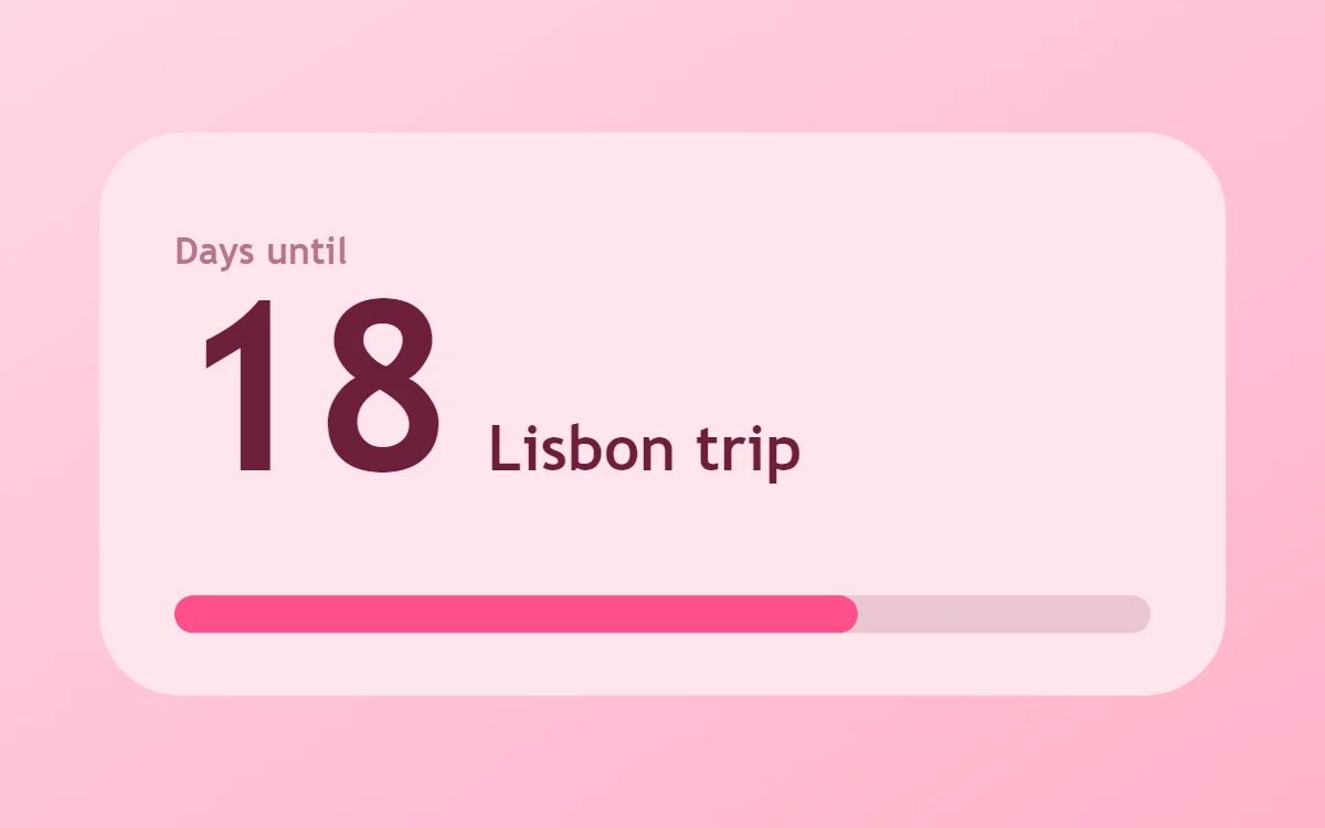 Pink countdown widgetFree to build
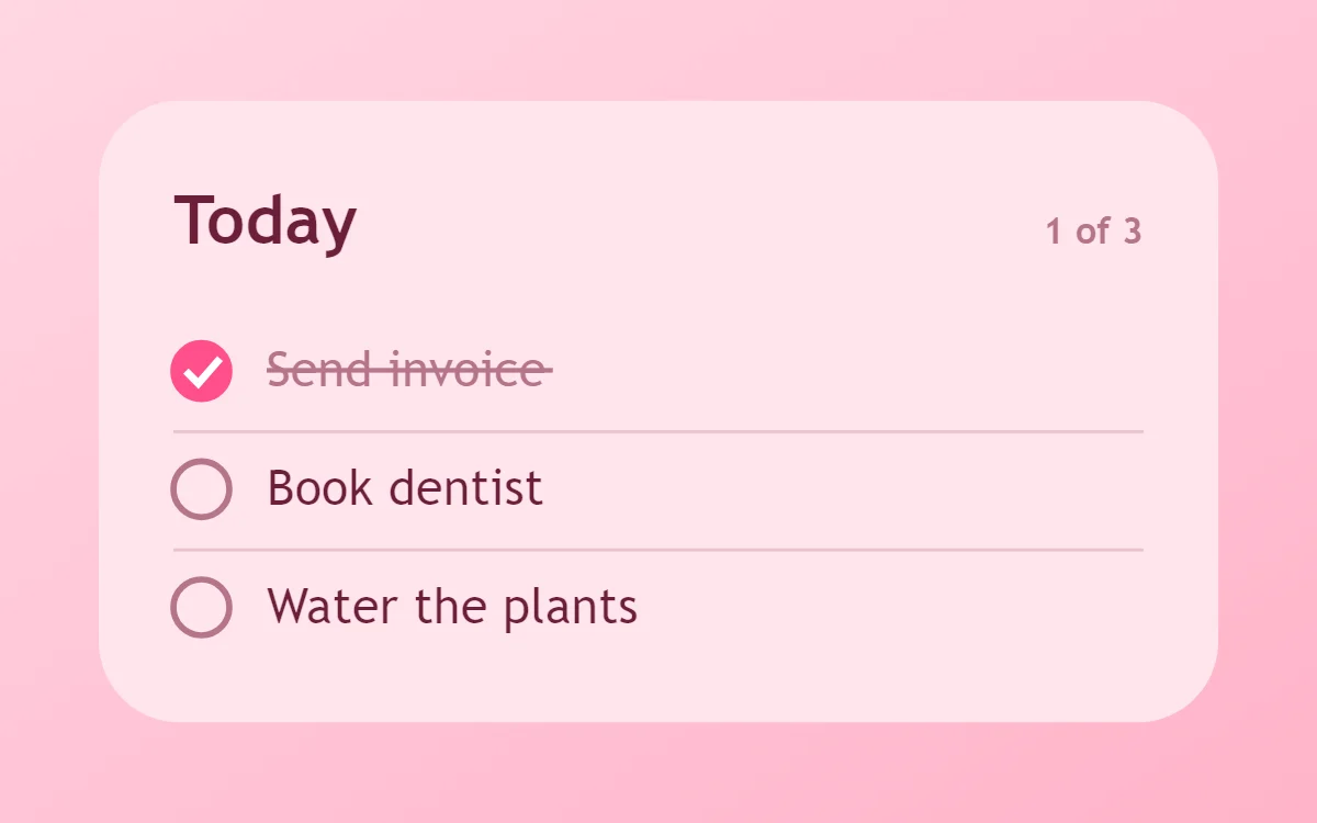 Pink to-do list widgetFree to build
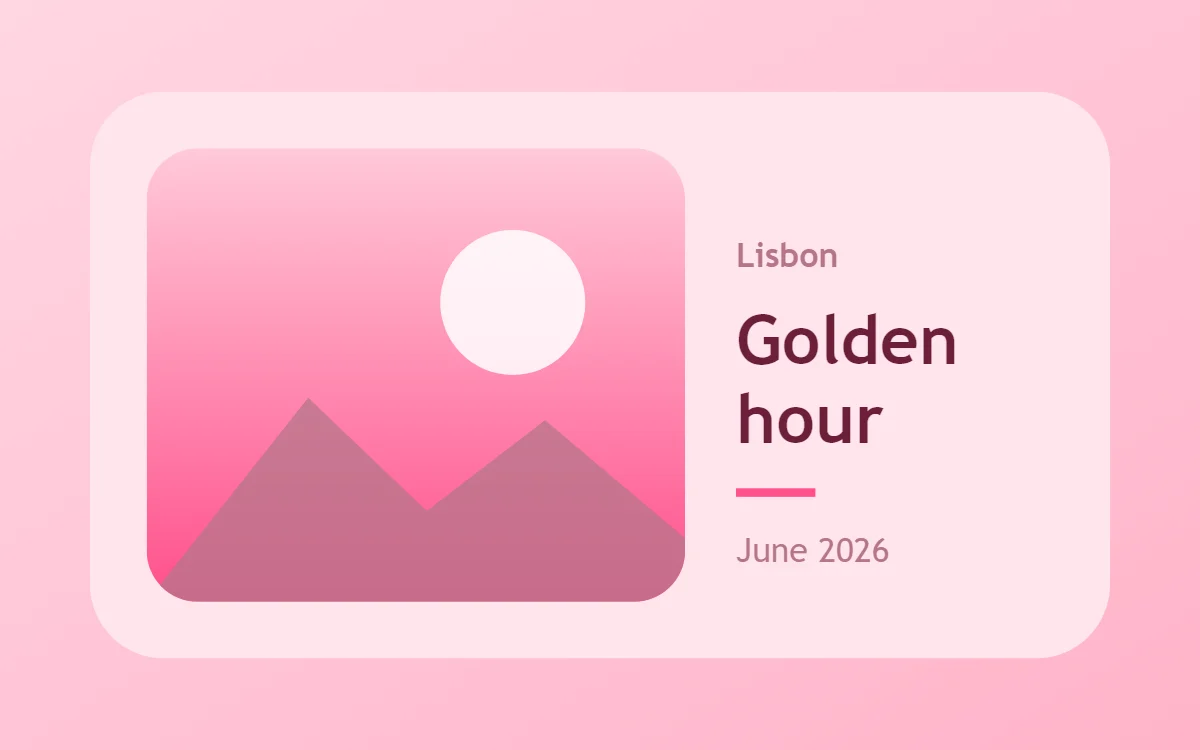 Pink photo widgetFree to build
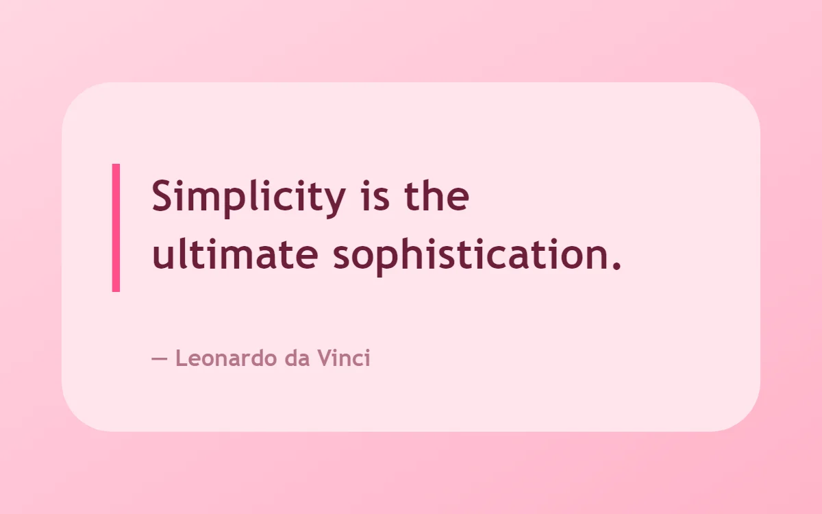 Pink quote widgetFree to build
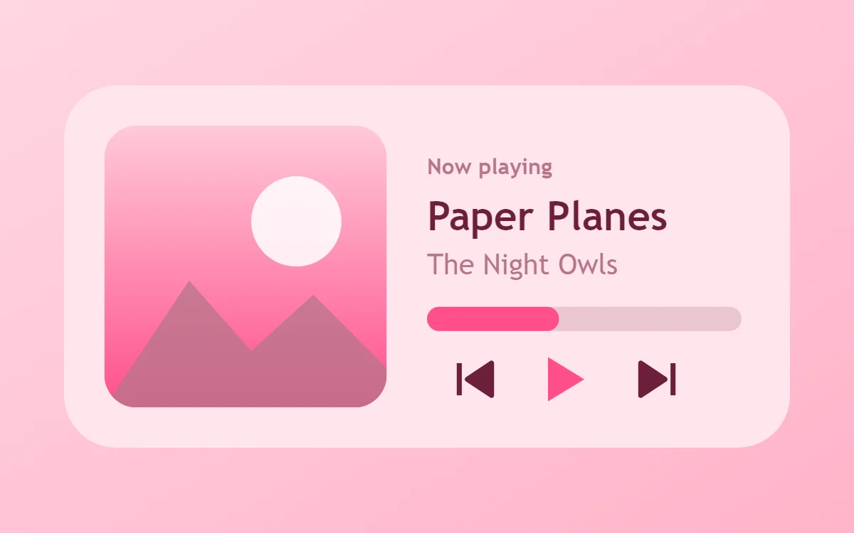 Pink music widgetData needs Pro
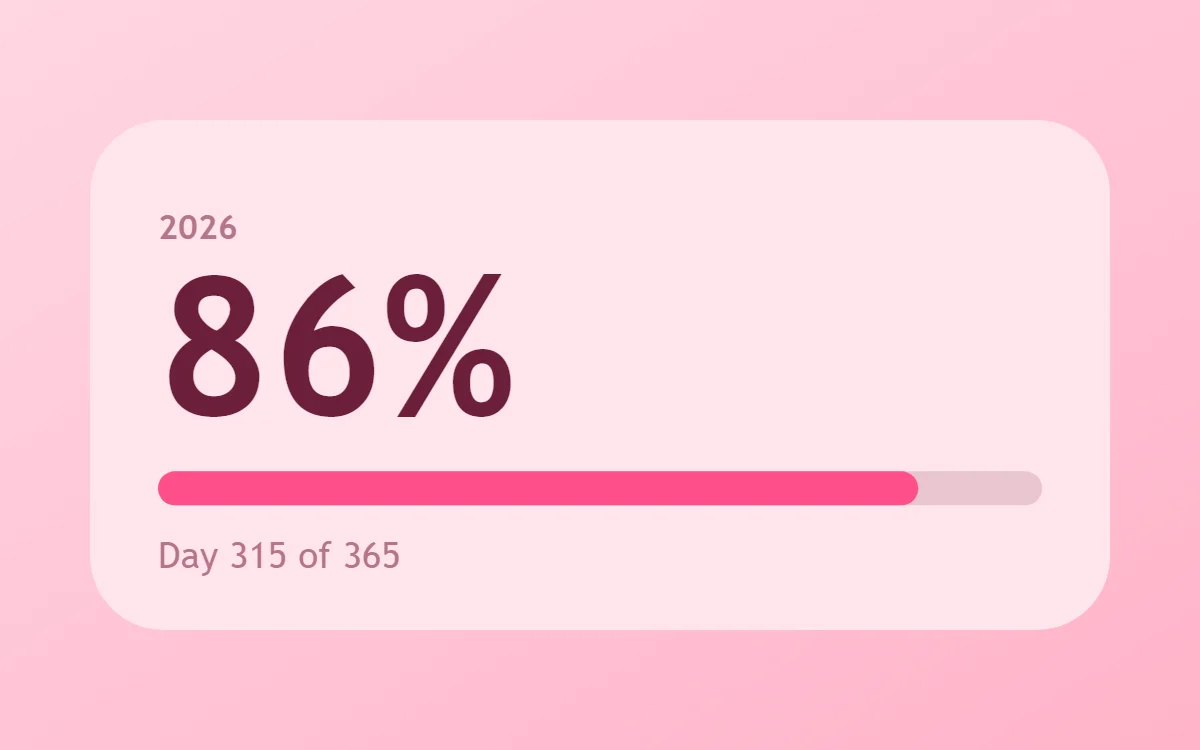 Pink year progress widgetFree to build
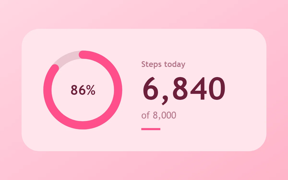 Pink step counter widgetData needs Pro
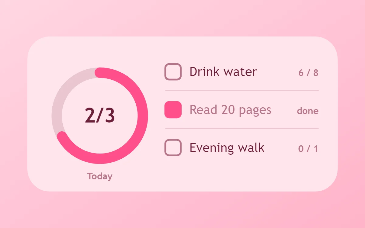 Pink habit tracker widgetFree to build
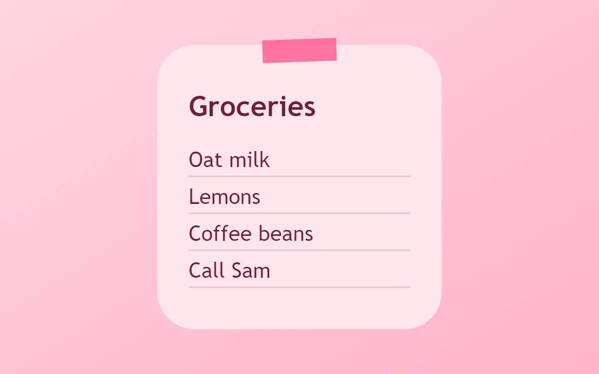 Pink sticky note widgetFree to build
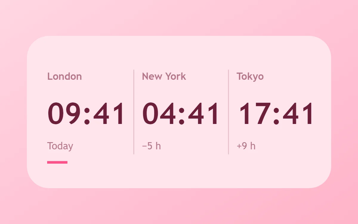 Pink world clock widgetFree to build
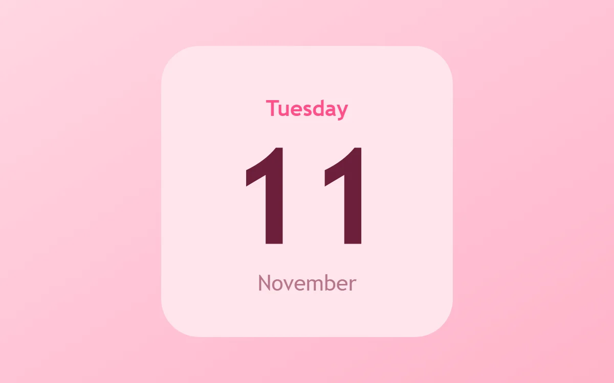 Pink date widgetFree to build
The pink palette
- Blush
#FFE4ECBackground - Rose
#FFC9D9Surface and tracks - Berry
#6B1F3AText - Dusty pink
#B5758ALabels - Hot pink
#FF4F8BAccent
Design rules
- Text: Use deep berry for text so it reads clearly on pink.
- Numbers: Make numbers berry and bold.
- Bars and rings: Use hot pink bars on a rose track.
- Photos: Add a rose border with rounded corners.
- Lists: Use round pink checkboxes.
Do
- Use three pinks: light for the background, mid for tracks, bright for the accent.
- Choose a dark berry instead of black.
Avoid
- Do not put white text on pale pink.
- Do not add other bright colors.
Wallpaper and icons
A blush gradient, pink clouds or flowers.
Pink or white icon packs.
Questions
What colors suit pink widgets?
Start with Blush (#FFE4EC) for the background, Berry (#6B1F3A) for text and Hot pink (#FF4F8B) as the accent.
Which font works for pink widgets?
Use Nunito (import the font file), or the built-in Sans, at weight 700.
Does WidgetCraft have pink widgets ready to use?
There is no ready-made pink pack at the moment. Each recipe on this page lists the exact settings to build one in a few minutes, and most use only free features.