 WidgetCraftGet the app
Art Deco · Home screen setup
Art Deco home screen setup
Art Deco widgets take the look of 1920s posters and hotel signage: thin gold lines, strict symmetry, tall elegant capitals and ivory or black grounds. This setup uses three widgets, one wallpaper and one palette so the whole screen reads as a single design.
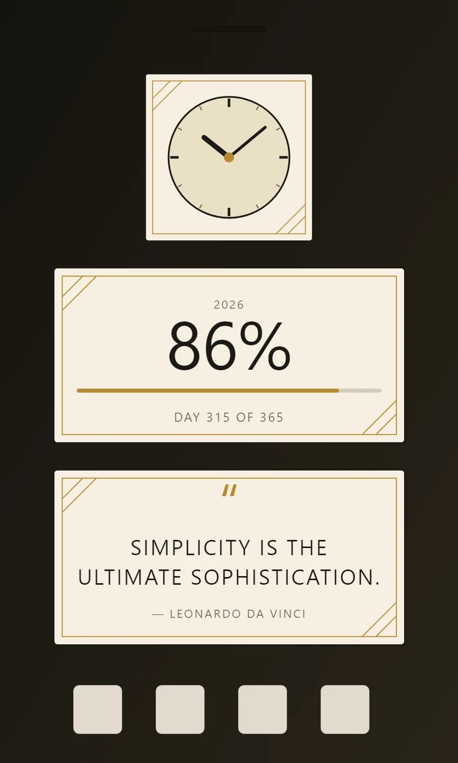
The three Art Deco widgets
- Art Deco analog clock widget (2 × 2): shows the time on a round dial with hour and minute hands.
- Art Deco year progress widget (4 × 2): shows how much of the year has passed as a percentage and a bar.
- Art Deco quote widget (4 × 2): displays a line you want to see every day.
Place them top to bottom in that order and leave the row above the dock empty so the wallpaper has room.
Analog clock widget settings
An analog clock reads as a shape rather than as numbers, which makes it the most decorative way to show the time. WidgetCraft has a dedicated analog layer where the dial, markers and each hand can be styled separately.
- Canvas: 200 × 200, background #F6F0E1, corner radius 4, outline 2 pt #1C1A16
- Analog: dial #EADFC6, ring 2 pt in #1C1A16
- Markers: 12 ticks, quarter-hours in #1C1A16 (3 pt), others in #7A6F58 (1.5 pt)
- Bars and rings: Use thin gold arcs, fans and double outlines; keep everything symmetrical.
Free to build. Full recipe and steps.
Year progress widget settings
A year-progress widget is a gentle nudge: one bar that fills from 1 January to 31 December. The same layout works for the day, the week or a personal goal.
- Canvas: 360 × 180, background #F6F0E1, corner radius 4, outline 2 pt #1C1A16
- Text: year label, size 12, color #7A6F58
- Text (formula): percentage of the year, Poiret One, size 68, color #1C1A16
- Bars and rings: Use thin gold arcs, fans and double outlines; keep everything symmetrical.
Free to build. Full recipe and steps.
Quote widget settings
A quote widget is pure typography, so the style shows more clearly here than anywhere else. Line length, line spacing and the size of the quotation mark do the design work.
- Canvas: 360 × 180, background #F6F0E1, corner radius 4, outline 2 pt #1C1A16
- Text: opening quotation mark, size 54, color #B8892E
- Text: quote in two lines, Poiret One, weight 400, size 22, line spacing 1.35, color #1C1A16, center aligned
- Text: Use tall thin capitals with wide letter spacing and center every line.
Free to build. Full recipe and steps.
How to set up an Art Deco home screen
- Set the wallpaper first, so you can judge every color against it.
- Build the analog clock widget and add it to the home screen at 2 × 2.
- Duplicate its canvas settings for the year progress and quote widgets so the background, radius and outline match exactly.
- Place all three, then adjust margins until the left edges line up.
- Change the icons last, and remove any app you do not use daily from the page.
Art Deco wallpaper ideas
Black, deep green or navy wallpapers make the gold lines stand out. Geometric fan patterns also fit.
Art Deco icons and dock
Thin line icons in gold or ivory; avoid colorful icon packs.
Art Deco home screen colors
- Ivory
#F6F0E1Background - Champagne
#EADFC6Surface and tracks - Onyx
#1C1A16Text - Bronze grey
#7A6F58Labels - Gold
#B8892EAccent
Fonts for an Art Deco home screen
Use Poiret One (import the font file), or the built-in Sans at weight 400, with labels in capitals. Corner radius is 4 on every widget so the shapes match.
Do and avoid
- Center the layout and mirror the left and right sides.
- Use gold only for lines, never for large fills.
- Do not left-align; Deco depends on symmetry.
- Do not use heavy bold type.