 WidgetCraftGet the app
Dark academia · Year progress · 4 × 2 widget
Dark academia year progress widget
A dark academia year progress widget shows how much of the year has passed as a percentage and a bar. Old libraries: deep brown, parchment, gold and classic serifs. This page gives the exact colors, type settings and layers, with a preview drawn from the same values.
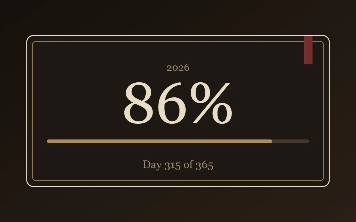
What a dark academia year progress widget shows
A year-progress widget is a gentle nudge: one bar that fills from 1 January to 31 December. The same layout works for the day, the week or a personal goal.
It is calculated from the date, so it is free, offline and needs no permission. WidgetCraft includes a free Day progress component, and a formula can stretch it to the year.
How the dark academia style shapes it
Dark academia widgets look like a leather-bound notebook: deep brown and black grounds, parchment text, a gold accent and classical serif type suited to quotes and reading goals.
- Bars and rings: Use thin brass lines; treat progress like a bookmark ribbon.
- Numbers: Use old-style serif numerals, centered, with a brass rule beneath.
Dark academia year progress widget recipe
| Layer | Settings |
|---|---|
| Canvas | 360 × 180, background #1F1813, corner radius 8, outline 1 pt #E8DCC4 |
| Text | year label, size 12, color #9C8B72 |
| Text (formula) | percentage of the year, Cormorant Garamond, size 68, color #E8DCC4 |
| Progress | a thin 4-point bar, 312 wide, progress #B08D57, range 0 to 365 |
| Text | "Day 315 of 365", size 13, color #9C8B72 |
| Ornament | a thin brass outline inset 7 points, and a short burgundy ribbon (a 10 × 34 rectangle) hanging from the top right like a bookmark |
| Font | Cormorant Garamond (import the font file), or the built-in Serif |
| Home screen size | 4 × 2 cells |
Dark academia color palette
- Walnut
#1F1813Background - Leather
#2C221ASurface and tracks - Parchment
#E8DCC4Text - Dust
#9C8B72Labels - Brass
#B08D57Accent
How to make a dark academia year progress widget in WidgetCraft
- Create a widget and open Canvas. Set the size to 360 × 180, the background to #1F1813 and the corner radius to 8. Add a 1-point outline.
- Tap Add and choose Progress. Make it 312 wide, styled as a thin 4-point bar.
- Open Data and connect it to the day of the year with a range of 0 to 365.
- Color the progress #B08D57 and keep the track faint.
- Add a Text layer for the percentage at size 68 in #E8DCC4, and a smaller one for the day count at size 13 in #9C8B72.
- Add the dark academia ornament with Shape layers and move them below the other layers in Layers: a thin brass outline inset 7 points, and a short burgundy ribbon (a 10 × 34 rectangle) hanging from the top right like a bookmark.
- Tap Save, then Add to home screen and resize the widget on your launcher if needed.
Everything in this recipe works in the free version.
Tips for dark academia year progress widgets
- Keep the background very dark brown rather than black.
- Use brass for lines and one burgundy detail.
- Show both the percentage and the day count so the bar has context.
- Use a segmented bar if you want each step to feel like a milestone.
- For a goal of your own, connect the bar to a counter instead of the date.
- Do not use sans-serif display type.
- Do not use bright white text.
Questions about the dark academia year progress widget
What size is a dark academia year progress widget?
It is designed for 4 × 2 home screen cells on a 360 × 180 canvas. You can resize it on the launcher and the design scales in proportion.
Which colors does it use?
Walnut (#1F1813) for the background, Parchment (#E8DCC4) for the main text, Dust (#9C8B72) for labels and Brass (#B08D57) as the accent.
Is it free to make?
Yes. Year progress widgets use free features in WidgetCraft, and the dark academia styling is free too.
What else is this style called?
People also search for academia year progress widget, library aesthetic year progress widget, vintage study year progress widget. They describe the same look as this dark academia year progress widget.
More dark academia widgets
- Dark academia clock widget
- Dark academia analog clock widget
- Dark academia calendar widget
- Dark academia battery widget
- Dark academia countdown widget
- Dark academia to-do list widget
- Dark academia photo widget
- Dark academia quote widget
- Dark academia music widget
- Dark academia step counter widget
- Dark academia habit tracker widget
- Dark academia sticky note widget
- Dark academia world clock widget
- Dark academia date widget
- Dark academia home screen setup
- All dark academia widgets