 WidgetCraftGet the app
Bauhaus · Clock · 4 × 2 widget
Bauhaus clock widget
A Bauhaus clock widget shows the time in large numerals with the day and date beneath. Primary colors and simple geometry: circles, squares and bars. This page gives the exact colors, type settings and layers, with a preview drawn from the same values.
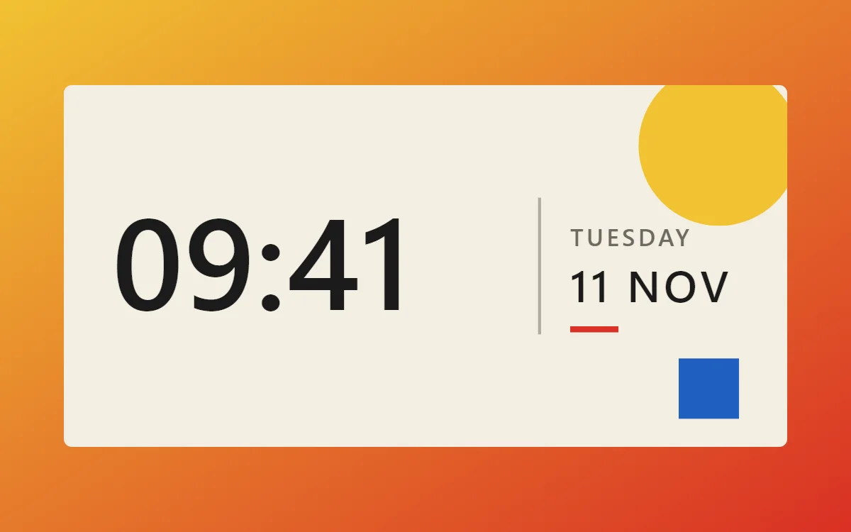
What a Bauhaus clock widget shows
A digital clock is the widget most people place first. It needs to be readable from arm's length, so the time takes most of the space and the date sits quietly below it.
It uses the phone's own time, so it needs no permission and works offline. WidgetCraft's clock layer follows your 12- or 24-hour setting unless you choose a format.
How the Bauhaus style shapes it
Bauhaus widgets are built from basic shapes in red, yellow and blue on an off-white ground. Circles become dials, bars become progress and type stays geometric and plain.
- Numbers: Place numbers inside or next to a solid circle or square so the shape frames them.
- Text: Use a geometric sans in capitals and keep it small beside the shapes.
Bauhaus clock widget recipe
| Layer | Settings |
|---|---|
| Canvas | 360 × 180, background #F4EFE3, corner radius 4 |
| Layout | split: the time on the left at size 64, a thin divider at x 236, and the weekday and date stacked in a column on the right |
| Text or Date | weekday, Josefin Sans, size 12, color #6D6A62, capitals, letter spacing 0.1 |
| Clock | format HH:mm, Josefin Sans, weight 600, size 78, color #1B1B1B, left aligned |
| Date | day and month, size 15, color #6D6A62 |
| Shape | small dot or rule in #D93025 |
| Ornament | a large yellow circle (Shape) in the top right corner and a 30 × 30 blue square in the bottom right, both behind the content |
| Font | Josefin Sans (import the font file), or the built-in Sans |
| Home screen size | 4 × 2 cells |
Bauhaus color palette
- Canvas
#F4EFE3Background - Cream
#E8E0CESurface and tracks - Black
#1B1B1BText - Graphite
#6D6A62Labels - Signal red
#D93025Accent
How to make a Bauhaus clock widget in WidgetCraft
- Create a widget and open Canvas. Set the size to 360 × 180, the background to #F4EFE3 and the corner radius to 4.
- Tap Add and choose Clock. Set the format to hours and minutes, the font to Josefin Sans, the size to 78 and the color to #1B1B1B.
- Add a Date layer above it for the weekday at size 12 in #6D6A62, in capitals.
- Add a second Date layer below for the day and month at size 15.
- Add a small Shape in #D93025 as the only accent, and align every layer to the same left margin of 24.
- Arrange the layers in the split layout: the time on the left at size 64, a thin divider at x 236, and the weekday and date stacked in a column on the right.
- Add the Bauhaus ornament with Shape layers and move them below the other layers in Layers: a large yellow circle (Shape) in the top right corner and a 30 × 30 blue square in the bottom right, both behind the content.
- Tap Save, then Add to home screen and resize the widget on your launcher if needed.
Everything in this recipe works in the free version.
Tips for Bauhaus clock widgets
- Limit color to red, yellow, blue, black and cream.
- Let one large shape dominate each widget.
- Seconds make a home screen widget look busy and Android updates widgets about once a minute, so leave them out.
- Check the widest time, such as 22:58 or 12:48 PM, so it never touches the edges.
- If the launcher crops the widget, reduce the time size before reducing the margins.
- Do not use gradients or shadows.
- Do not round shapes halfway; use full circles or square corners.
Ready-made Bauhaus templates
WidgetCraft includes a Bauhaus template pack you can import and edit instead of starting from a blank canvas.
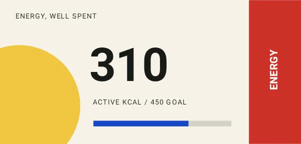 Energy composition7 editable layers
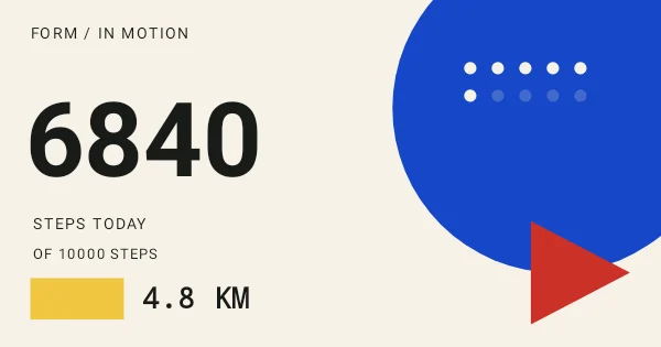 Form in motion18 editable layers
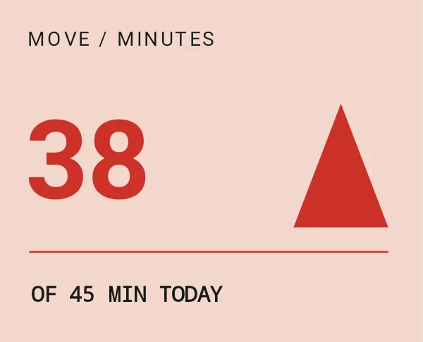 Minutes of momentum5 editable layers
Questions about the Bauhaus clock widget
What size is a Bauhaus clock widget?
It is designed for 4 × 2 home screen cells on a 360 × 180 canvas. You can resize it on the launcher and the design scales in proportion.
Which colors does it use?
Canvas (#F4EFE3) for the background, Black (#1B1B1B) for the main text, Graphite (#6D6A62) for labels and Signal red (#D93025) as the accent.
Is it free to make?
Yes. Clock widgets use free features in WidgetCraft, and the Bauhaus styling is free too.
What else is this style called?
People also search for geometric clock widget, primary color clock widget, bauhaus design clock widget. They describe the same look as this Bauhaus clock widget.
More Bauhaus widgets
- Bauhaus analog clock widget
- Bauhaus calendar widget
- Bauhaus battery widget
- Bauhaus countdown widget
- Bauhaus to-do list widget
- Bauhaus photo widget
- Bauhaus quote widget
- Bauhaus music widget
- Bauhaus year progress widget
- Bauhaus step counter widget
- Bauhaus habit tracker widget
- Bauhaus sticky note widget
- Bauhaus world clock widget
- Bauhaus date widget
- Bauhaus home screen setup
- All Bauhaus widgets