 WidgetCraftGet the app
Styles with a ready-made WidgetCraft pack
Bauhaus widgets for Android
Primary colors and simple geometry: circles, squares and bars. Bauhaus widgets are built from basic shapes in red, yellow and blue on an off-white ground. Circles become dials, bars become progress and type stays geometric and plain.
Also known as: geometric widgets, primary color widgets, bauhaus design widgets.
Ready-made Bauhaus templates in WidgetCraft
These are real templates from the app's Bauhaus pack. Import one, then change any layer.
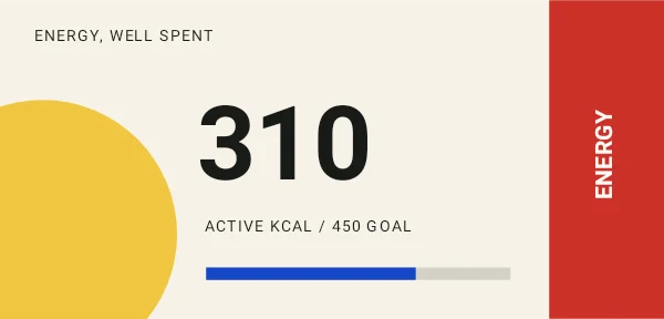
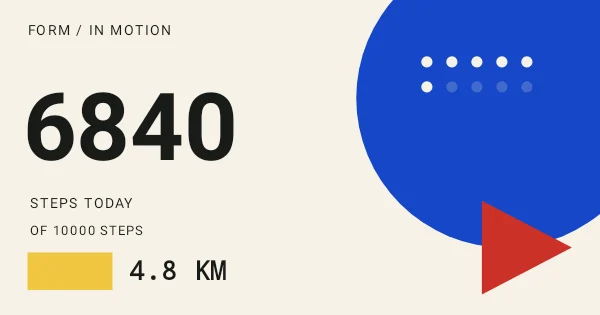
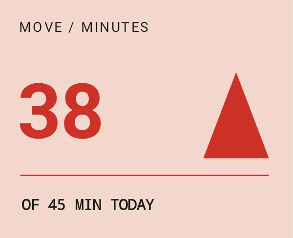
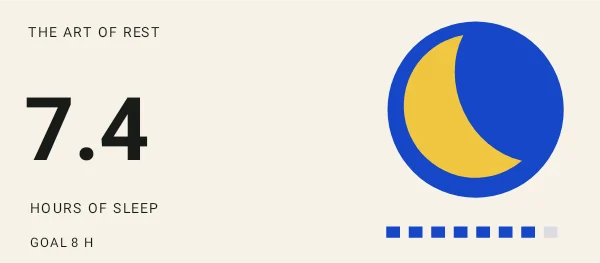
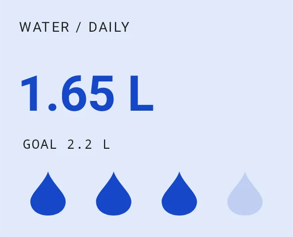
Bauhaus widget recipes
Each recipe has a preview, exact colors and layer-by-layer steps.
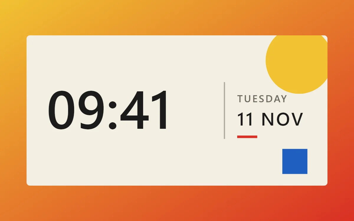 Bauhaus clock widgetFree to build
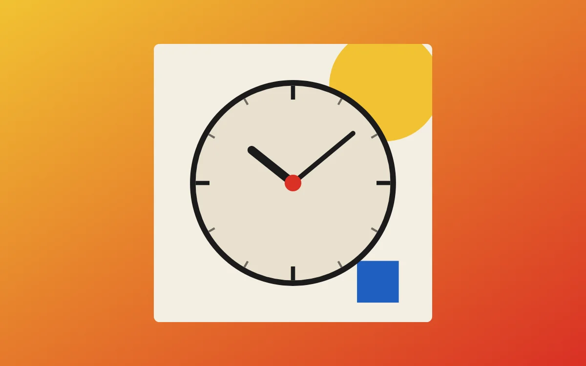 Bauhaus analog clock widgetFree to build
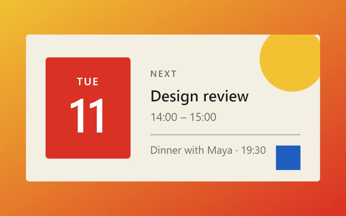 Bauhaus calendar widgetData needs Pro
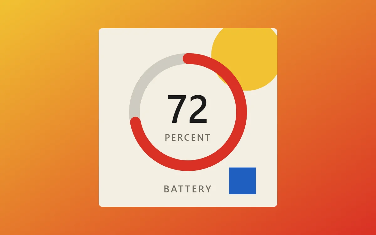 Bauhaus battery widgetFree to build
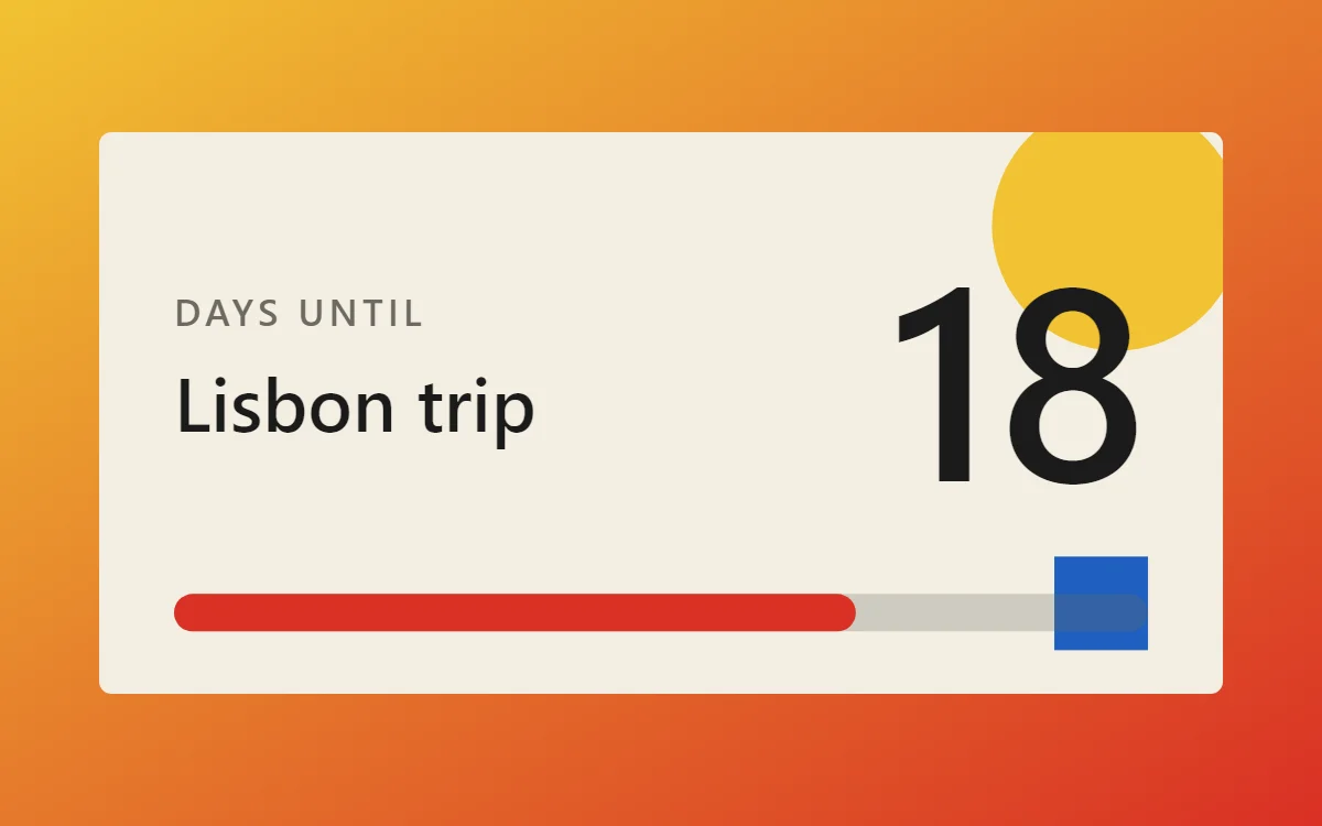 Bauhaus countdown widgetFree to build
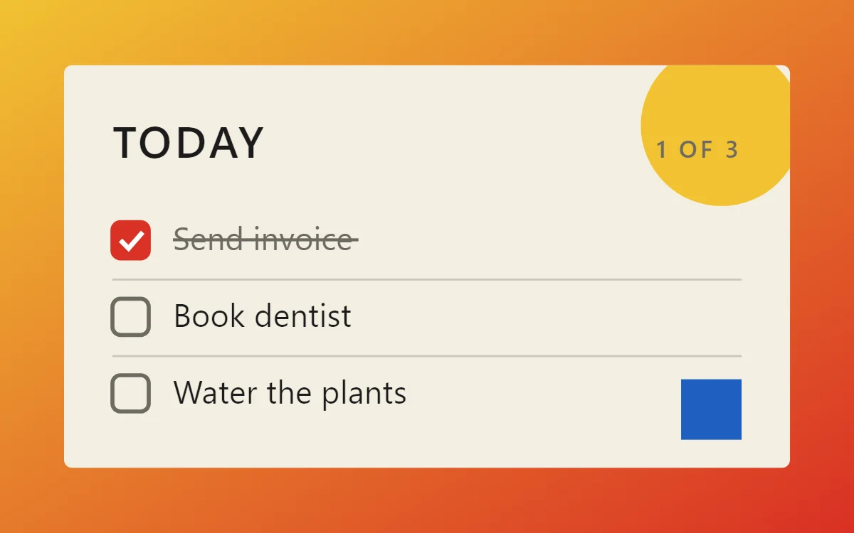 Bauhaus to-do list widgetFree to build
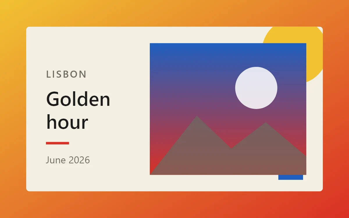 Bauhaus photo widgetFree to build
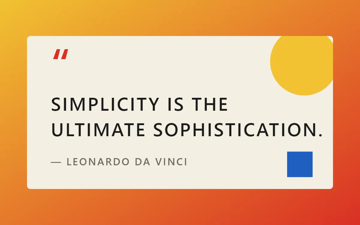 Bauhaus quote widgetFree to build
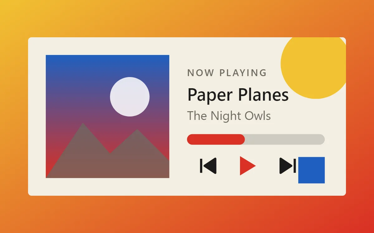 Bauhaus music widgetData needs Pro
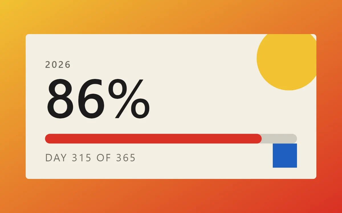 Bauhaus year progress widgetFree to build
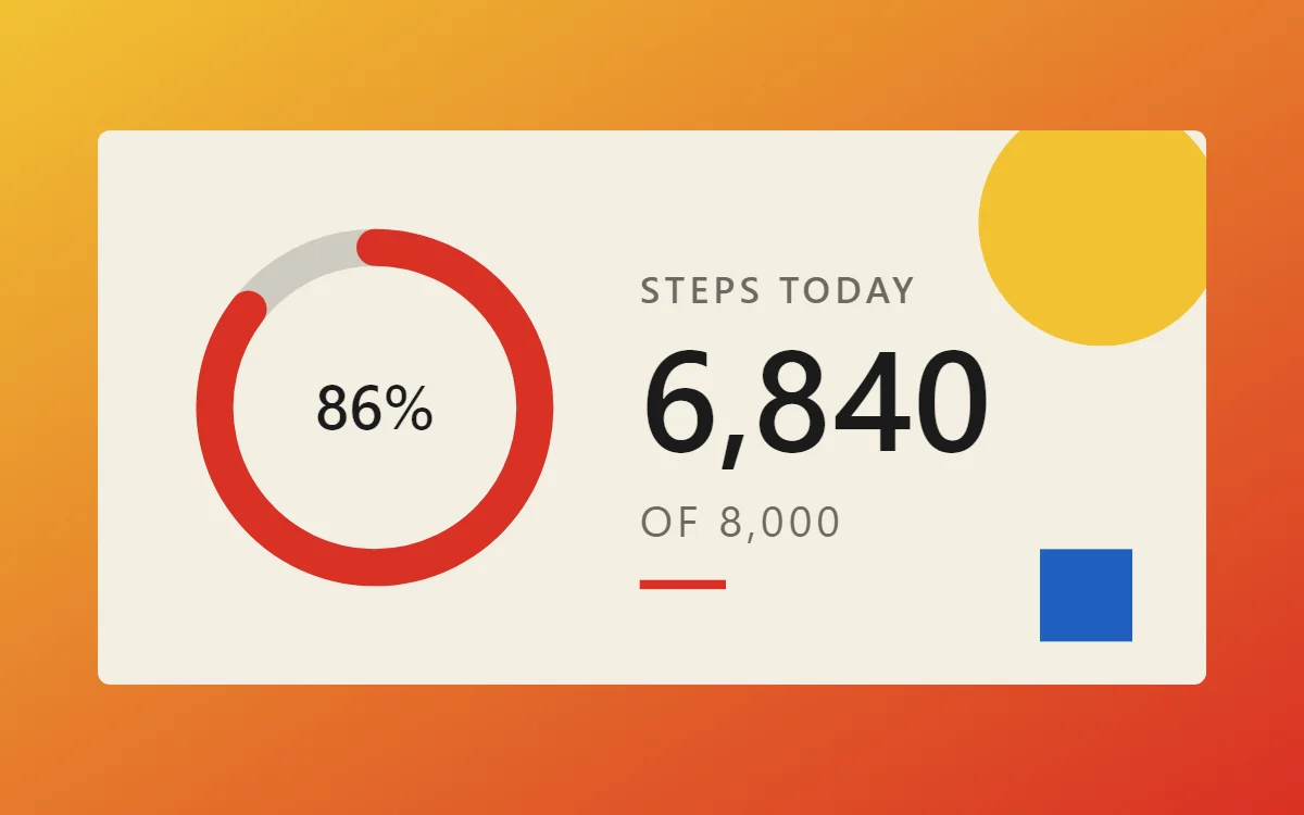 Bauhaus step counter widgetData needs Pro
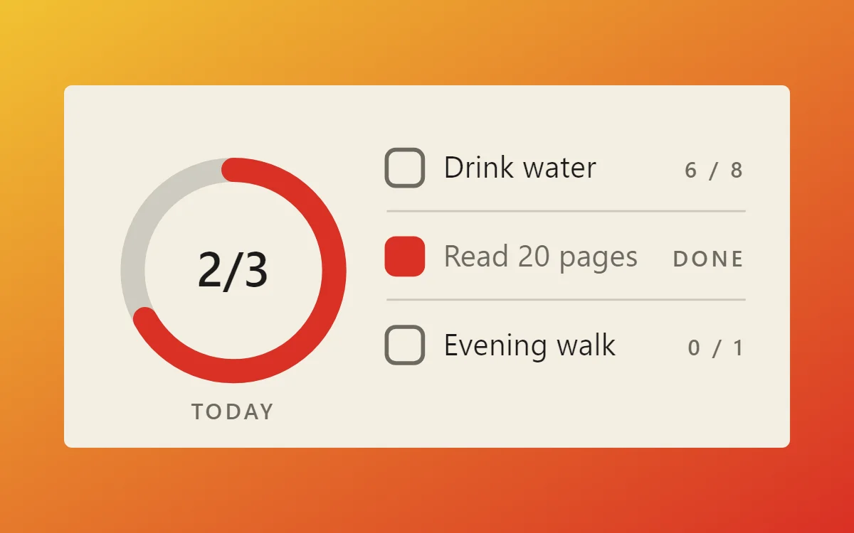 Bauhaus habit tracker widgetFree to build
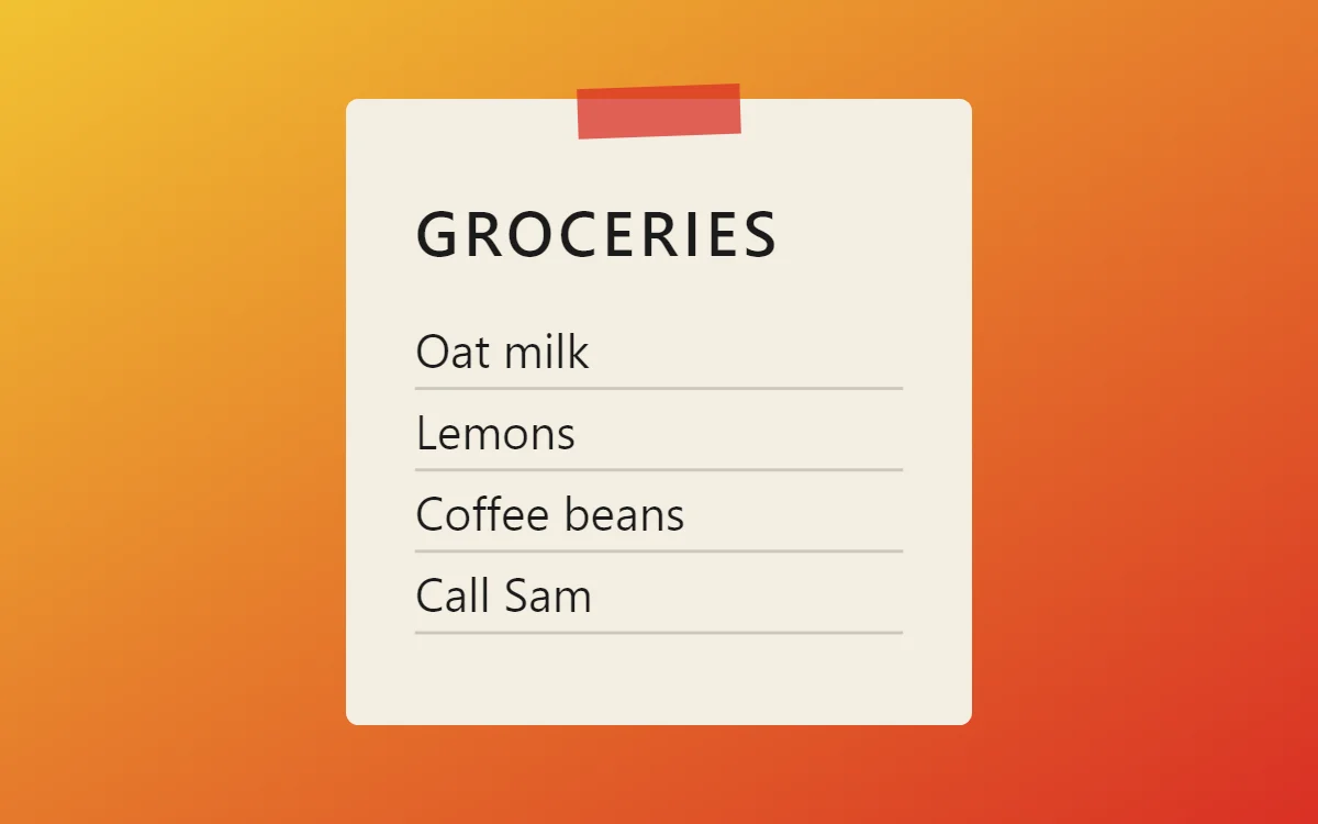 Bauhaus sticky note widgetFree to build
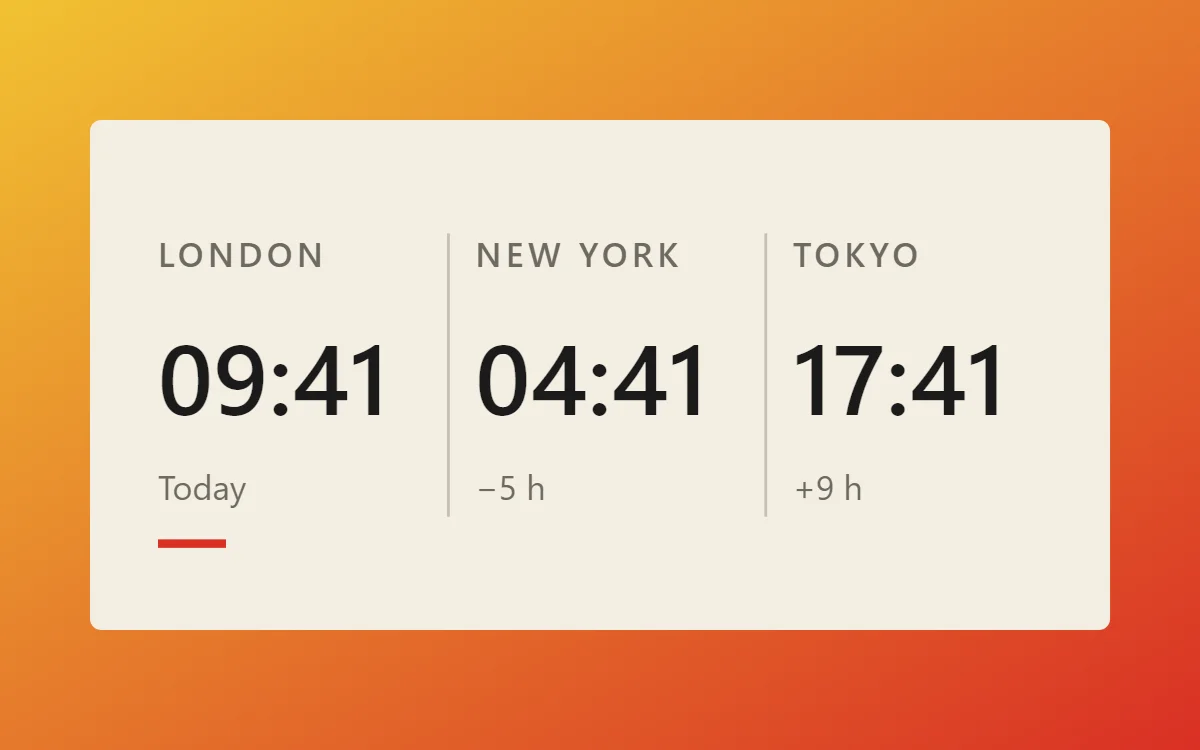 Bauhaus world clock widgetFree to build
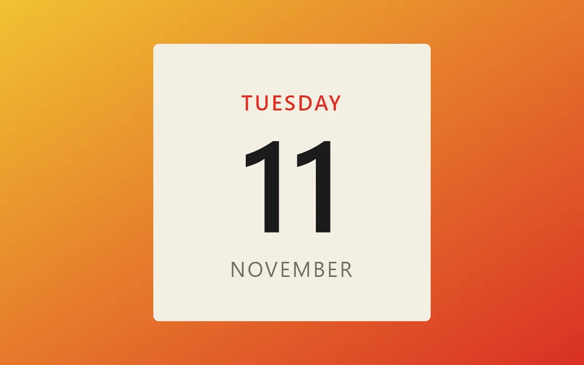 Bauhaus date widgetFree to build
The Bauhaus palette
- Canvas
#F4EFE3Background - Cream
#E8E0CESurface and tracks - Black
#1B1B1BText - Graphite
#6D6A62Labels - Signal red
#D93025Accent
Design rules
- Text: Use a geometric sans in capitals and keep it small beside the shapes.
- Numbers: Place numbers inside or next to a solid circle or square so the shape frames them.
- Bars and rings: Build the whole widget from a circle, a square and a bar, each in a different primary color.
- Photos: Mask photos into a circle or half-circle and set them against a flat color block.
- Lists: Mark each row with a small colored square or circle instead of a checkbox outline.
Do
- Limit color to red, yellow, blue, black and cream.
- Let one large shape dominate each widget.
Avoid
- Do not use gradients or shadows.
- Do not round shapes halfway; use full circles or square corners.
Wallpaper and icons
A cream or solid primary-color wallpaper, or a simple geometric composition.
Use flat geometric icons, ideally in the same three primary colors.
Questions
What colors suit Bauhaus widgets?
Start with Canvas (#F4EFE3) for the background, Black (#1B1B1B) for text and Signal red (#D93025) as the accent.
Which font works for Bauhaus widgets?
Use Josefin Sans (import the font file), or the built-in Sans, at weight 600 with labels in capitals.
Does WidgetCraft have Bauhaus widgets ready to use?
Yes. The Bauhaus template pack has 5 templates you can import and edit.