 WidgetCraftGet the app
Coquette · Calendar · 4 × 2 widget
Coquette calendar widget
A coquette calendar widget shows today's date beside your next event. Soft pink, cream and ribbon bows with romantic serif type. This page gives the exact colors, type settings and layers, with a preview drawn from the same values.
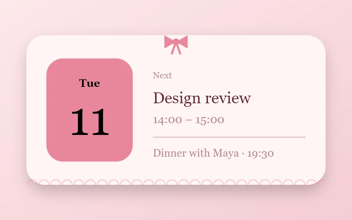
What a coquette calendar widget shows
A calendar widget answers two questions: what day is it, and what is next. The date sits in a bold block on the left and the next event takes the right side.
The date works with no permission. Showing events needs Android's calendar permission and a calendar connection, which is a Pro feature in WidgetCraft. Without it you can still build the date block on its own for free.
How the coquette style shapes it
Coquette widgets are delicate and romantic: ballet pink and cream, a deep rose for text, small ribbon bows, lace-like edges and an elegant italic serif.
- Numbers: Set numbers in the serif at a medium weight, never heavy.
- Lists: Use small round pink checkboxes and generous line spacing.
Coquette calendar widget recipe
| Layer | Settings |
|---|---|
| Canvas | 360 × 180, background #FFF4F4, corner radius 22, soft shadow radius 12 at low opacity |
| Shape | date block 104 × 124, radius 20, fill #E8879C |
| Date | weekday (size 13) and day number (size 58) centered on the block, color #000000 |
| Text | label "Next", size 11, color #B88A92 |
| List or Text | next event title, Playfair Display, size 19, color #5E2433; time at size 14 in #B88A92 |
| Shape | divider 1.5 pt in #B88A92 at 40% opacity |
| Ornament | a small ribbon bow tied over the top edge at the center (two triangles, two short tails and a center dot) and a row of thin half-circles along the bottom edge like lace |
| Font | Playfair Display (import the font file), or the built-in Serif |
| Home screen size | 4 × 2 cells |
Coquette color palette
- Cream
#FFF4F4Background - Ballet pink
#FBE1E4Surface and tracks - Wine
#5E2433Text - Mauve
#B88A92Labels - Ribbon pink
#E8879CAccent
How to make a coquette calendar widget in WidgetCraft
- Create a widget and open Canvas. Set the size to 360 × 180, the background to #FFF4F4 and the corner radius to 22.
- Add a Shape on the left, 104 × 124 with radius 20, filled with #E8879C.
- Add two Date layers over it: the short weekday at size 13 and the day number at size 58, both in #000000.
- Add a Text label "Next" at size 11 in #B88A92.
- Add a List layer, open Data and choose your calendar. Set the title to size 19 in #5E2433 and the time to size 14 in #B88A92.
- Add the coquette ornament with Shape layers and move them below the other layers in Layers: a small ribbon bow tied over the top edge at the center (two triangles, two short tails and a center dot) and a row of thin half-circles along the bottom edge like lace.
- Tap Save, then Add to home screen and resize the widget on your launcher if needed.
The layout and styling are free. The live data connection for this widget needs WidgetCraft Pro, a one-time purchase.
Tips for coquette calendar widgets
- Add one bow per widget, not several.
- Keep the palette to pinks, cream and one warm gold.
- Event titles vary in length, so give the title a single line and let it truncate.
- Show one or two events at most in a 4 × 2 widget.
- If no events appear, check that the calendar you chose is the one your events are saved in.
- Do not use bold sans-serif fonts.
- Do not add bright, saturated colors.
Questions about the coquette calendar widget
What size is a coquette calendar widget?
It is designed for 4 × 2 home screen cells on a 360 × 180 canvas. You can resize it on the launcher and the design scales in proportion.
Which colors does it use?
Cream (#FFF4F4) for the background, Wine (#5E2433) for the main text, Mauve (#B88A92) for labels and Ribbon pink (#E8879C) as the accent.
Is it free to make?
The coquette design is free to build. Showing live events needs the one-time Pro upgrade.
What else is this style called?
People also search for coquette aesthetic calendar widget, bow calendar widget, girly calendar widget, balletcore calendar widget. They describe the same look as this coquette calendar widget.
More coquette widgets
- Coquette clock widget
- Coquette analog clock widget
- Coquette battery widget
- Coquette countdown widget
- Coquette to-do list widget
- Coquette photo widget
- Coquette quote widget
- Coquette music widget
- Coquette year progress widget
- Coquette step counter widget
- Coquette habit tracker widget
- Coquette sticky note widget
- Coquette world clock widget
- Coquette date widget
- Coquette home screen setup
- All coquette widgets