 WidgetCraftGet the app
iOS-style · Home screen setup
iOS-style home screen setup
This style follows the widgets people know from iPhones: white or dark rounded cards, a small colored title, a large bold number and tidy lists. It is a look, not an official Apple design. This setup uses three widgets, one wallpaper and one palette so the whole screen reads as a single design.
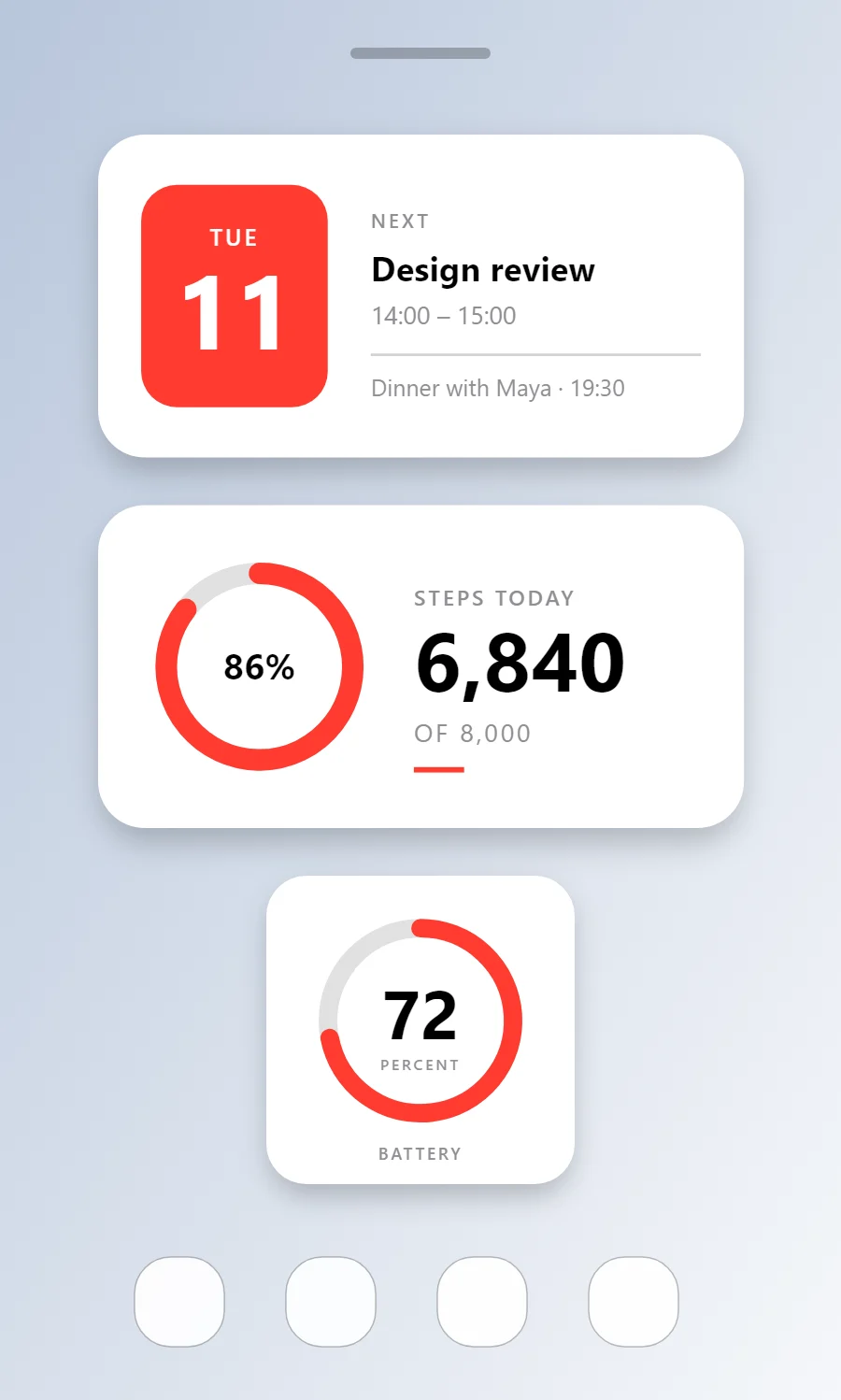
The three iOS-style widgets
- iOS-style calendar widget (4 × 2): shows today's date beside your next event.
- iOS-style step counter widget (4 × 2): shows today's steps against your goal.
- iOS-style battery widget (2 × 2): shows your charge level as a ring with the percentage in the middle.
Place them top to bottom in that order and leave the row above the dock empty so the wallpaper has room.
Calendar widget settings
A calendar widget answers two questions: what day is it, and what is next. The date sits in a bold block on the left and the next event takes the right side.
- Canvas: 360 × 180, background #FFFFFF, corner radius 26, soft shadow radius 12 at low opacity
- Shape: date block 104 × 124, radius 20, fill #FF3B30
- Date: weekday (size 13) and day number (size 58) centered on the block, color #FFFFFF
- Numbers: Use a heavy sans for the main number and a grey caption beside it.
Styling is free; the live data needs Pro. Full recipe and steps.
Step counter widget settings
A step widget shows one number and how close it is to a goal. A ring on one side and the count on the other reads well at a glance.
- Canvas: 360 × 180, background #FFFFFF, corner radius 26, soft shadow radius 12 at low opacity
- Ring: diameter 104, stroke 12, progress #FF3B30, range 0 to your goal
- Text: percentage inside the ring, size 20, color #000000
- Bars and rings: Use thick rings with rounded ends in one bright color.
Styling is free; the live data needs Pro. Full recipe and steps.
Battery widget settings
A battery widget turns one number into a shape you can read without thinking. A ring that fills clockwise is the clearest form, with the percentage inside it.
- Canvas: 200 × 200, background #FFFFFF, corner radius 26, soft shadow radius 12 at low opacity
- Ring: diameter 120, stroke 12, track #8E8E93 at 28% opacity, progress #FF3B30, round ends, start at top
- Battery: level as a number, built-in Sans, size 44, color #000000, centered in the ring
- Bars and rings: Use thick rings with rounded ends in one bright color.
Free to build. Full recipe and steps.
How to set up an iOS-style home screen
- Set the wallpaper first, so you can judge every color against it.
- Build the calendar widget and add it to the home screen at 4 × 2.
- Duplicate its canvas settings for the step counter and battery widgets so the background, radius and outline match exactly.
- Place all three, then adjust margins until the left edges line up.
- Change the icons last, and remove any app you do not use daily from the page.
iOS-style wallpaper ideas
A soft gradient or a clean photo; the white cards need a calmer background.
iOS-style icons and dock
Rounded-square icon packs keep the grid consistent.
iOS-style home screen colors
- White
#FFFFFFBackground - System grey
#F2F2F7Surface and tracks - Black
#000000Text - Label grey
#8E8E93Labels - Red
#FF3B30Accent
Fonts for an iOS-style home screen
Use built-in Sans at weight 700, with labels in capitals. Corner radius is 26 on every widget so the shapes match.
Do and avoid
- Keep the card white and the radius around 26.
- Use one bright color per widget as the title color.
- Do not copy Apple artwork or icons.
- Do not shrink margins below 16 points.