 WidgetCraftGet the app
One UI-style · Battery · 2 × 2 widget
One UI-style battery widget
A One UI-style battery widget shows your charge level as a ring with the percentage in the middle. Samsung-like rounded cards with soft color and clear type. This page gives the exact colors, type settings and layers, with a preview drawn from the same values.
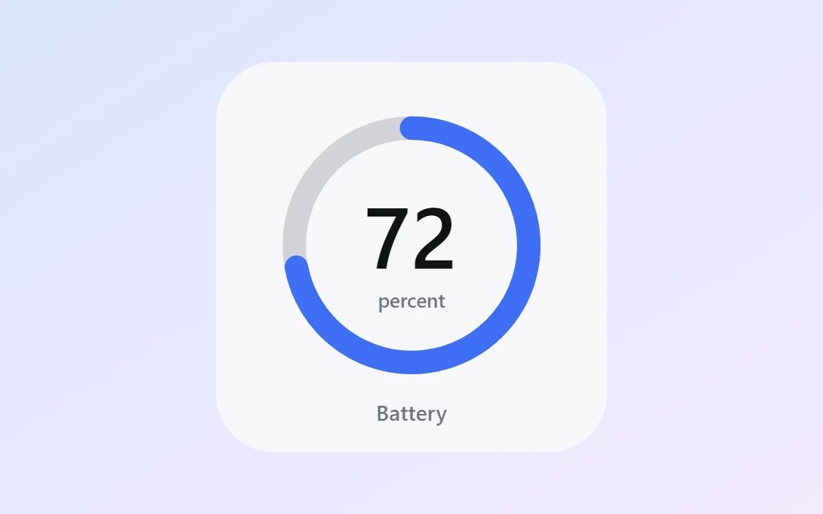
What a One UI-style battery widget shows
A battery widget turns one number into a shape you can read without thinking. A ring that fills clockwise is the clearest form, with the percentage inside it.
Battery level is a free, built-in source in WidgetCraft and needs no permission. The widget refreshes when the charge changes or the charger is connected.
How the One UI-style style shapes it
This style follows the widgets on Samsung Galaxy phones: softly colored rounded cards, clear bold headings and comfortable spacing sized for one-handed use. It is inspired by the look, not made by Samsung.
- Bars and rings: Use thick rounded bars in blue on a pale blue track.
- Numbers: Keep numbers bold and dark with a blue unit or label.
One UI-style battery widget recipe
| Layer | Settings |
|---|---|
| Canvas | 200 × 200, background #F7F7F9, corner radius 30 |
| Ring | diameter 120, stroke 12, track #70747D at 28% opacity, progress #3E6EF5, round ends, start at top |
| Battery | level as a number, built-in Sans, size 44, color #101114, centered in the ring |
| Text | "percent" at size 10 and "Battery" at size 11, color #70747D |
| Font | built-in Sans |
| Home screen size | 2 × 2 cells |
One UI-style color palette
- Cloud
#F7F7F9Background - Card blue
#E9ECF5Surface and tracks - Near black
#101114Text - Slate
#70747DLabels - Galaxy blue
#3E6EF5Accent
How to make a One UI-style battery widget in WidgetCraft
- Create a widget and open Canvas. Set the size to 200 × 200, the background to #F7F7F9 and the corner radius to 30.
- Tap Add and choose Ring. Set the diameter to 120 and the stroke to 12.
- Open Data for the ring and connect it to Battery level with a range of 0 to 100.
- Color the progress #3E6EF5 and the track #70747D at about 28% opacity.
- Add a Battery layer in the center at size 44 in #101114, then a small Text label underneath.
- Tap Save, then Add to home screen and resize the widget on your launcher if needed.
Everything in this recipe works in the free version.
Tips for One UI-style battery widgets
- Use radius 28 to 32 so the widget matches Samsung cards.
- Keep text large; this style favours reachability.
- Start the ring at the top and fill clockwise; other start points are harder to read.
- Keep the track visible at low opacity so an almost-empty ring still looks like a ring.
- A battery widget shows the phone only. Earbuds and watches need their maker's own widget.
- Do not use thin fonts.
- Do not crowd more than three items into a small card.
Questions about the One UI-style battery widget
What size is a One UI-style battery widget?
It is designed for 2 × 2 home screen cells on a 200 × 200 canvas. You can resize it on the launcher and the design scales in proportion.
Which colors does it use?
Cloud (#F7F7F9) for the background, Near black (#101114) for the main text, Slate (#70747D) for labels and Galaxy blue (#3E6EF5) as the accent.
Is it free to make?
Yes. Battery widgets use free features in WidgetCraft, and the One UI-style styling is free too.
What else is this style called?
People also search for samsung style battery widget, galaxy style battery widget, one ui battery widget. They describe the same look as this One UI-style battery widget.
More One UI-style widgets
- One UI-style clock widget
- One UI-style analog clock widget
- One UI-style calendar widget
- One UI-style countdown widget
- One UI-style to-do list widget
- One UI-style photo widget
- One UI-style quote widget
- One UI-style music widget
- One UI-style year progress widget
- One UI-style step counter widget
- One UI-style habit tracker widget
- One UI-style sticky note widget
- One UI-style world clock widget
- One UI-style date widget
- One UI-style home screen setup
- All One UI-style widgets