 WidgetCraftGet the app
Guide
Android widget sizes explained: 2×2, 4×1, 4×2 and 4×4
Sizes count home screen grid cells, columns first. A 4×2 widget is four icons wide and two rows tall.
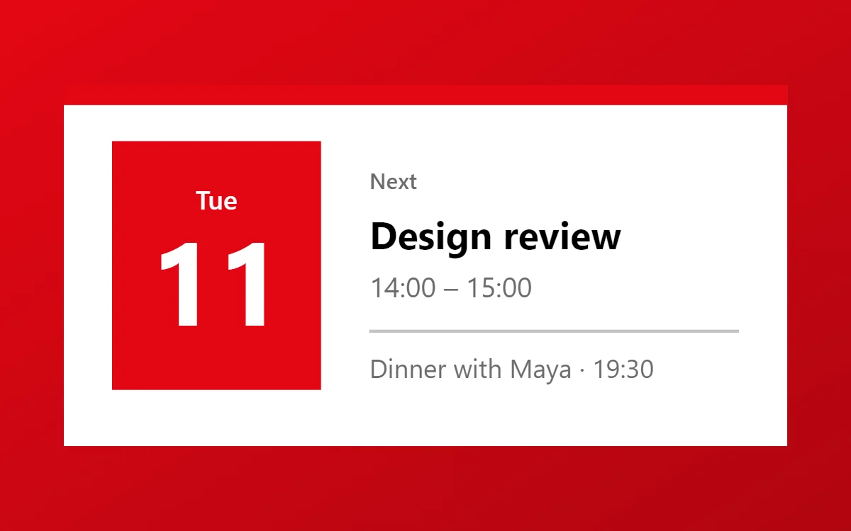
Cells, not pixels
A home screen is a grid of cells, each the size of one app icon with its label. Common grids are 4 × 5, 4 × 6 and 5 × 5. A widget size such as 4 × 2 means four cells wide and two cells tall.
The real size in pixels depends on the phone's screen, the launcher and the grid you chose. That is why the same 4 × 2 widget is a slightly different shape on a tall narrow phone than on a wide one.
Which size for which job
| Size | Good for | Avoid |
|---|---|---|
| 2 × 2 | One fact: a battery ring, an analog clock, a single photo | Lists and long text |
| 4 × 1 | One line: the date, a quote, a progress bar | Anything tall, such as rings |
| 4 × 2 | Clock and date, next event, three tasks, music controls | More than three rows of text |
| 4 × 4 | A large photo, a long list, a dashboard | A single small number |
Designing for more than one size
Build your design at the size you will use most, then test one size smaller. Text that only just fits will clip on a phone with narrower cells, so leave a margin of at least 16 points inside the widget.
In WidgetCraft the canvas size is a set of proportions, not a promise about pixels. A 360 × 180 canvas suits 4 × 2; 200 × 200 suits 2 × 2. The app scales the design to the space the launcher gives it.
Rounded corners
From Android 12 the system rounds the corners of widgets. If your own background has a much smaller radius, you may see a mismatch at the corners. Use a radius of about 16 to 28 for a full-bleed background, or keep the widget background transparent and round an inner shape instead.
Questions
What is the most useful widget size?
4 × 2. It is wide enough for readable text and short enough to leave room for apps.
Why does my 4 × 2 widget look different on another phone?
The cells are a different shape. Designs that scale in proportion will show slightly more or less margin.