 WidgetCraftGet the app
Guide
How to choose colors for home screen widgets
Take three colors from your wallpaper: a light one for backgrounds, a dark one for text and one bright one for accents.
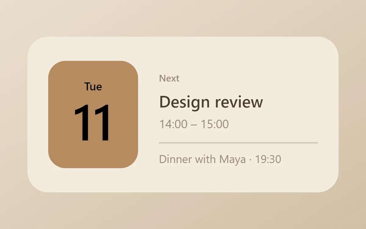
The three-color method
Most good widget designs use three roles: a background, a text color and a single accent. Add a fourth, quieter color for labels if you need it. More than that and the widget starts to compete with your wallpaper and icons.
- Pick the background from the lightest or darkest large area of your wallpaper.
- Pick the text color from the opposite end: dark on light, light on dark.
- Pick one accent from the most vivid small detail in the wallpaper.
Use the accent once
The accent is a pointer. Put it on the one thing you want the eye to find: the filled part of a progress bar, today's date, the play button. If three things are in the accent color, none of them stands out.
Check the contrast
Text needs to be clearly darker or lighter than what is behind it. A quick test: hold the phone at arm's length and squint. If the words blur into the background, increase the difference. Mid-grey text on a mid-tone color is the most common mistake.
Avoid pure black on pure white for long text; a very dark tint of your background hue, such as deep brown on cream, is easier on the eye and looks more deliberate.
Palettes that always work
- Paper and ink: off-white #F5F3EE, near-black #151515, one warm accent.
- True black: #000000, off-white #FAFAFA, one bright accent. Ideal on OLED screens.
- Tone on tone: three steps of one hue, such as sage, moss and forest green.
- Neutral warm: cream, cocoa brown and caramel.
Entering exact colors
WidgetCraft accepts hex codes such as #E4572E, and also has a color wheel with separate controls for lightness and transparency. Every style page on this site lists its palette as hex codes so you can copy it exactly.
Questions
How many colors should a widget have?
Three, plus an optional quiet color for labels.
Should widgets match the wallpaper or contrast with it?
Match the hue and contrast the lightness. A widget that shares the wallpaper's colors but is clearly lighter or darker looks intentional and stays readable.