 WidgetCraftGet the app
Guide
How to choose fonts for widgets
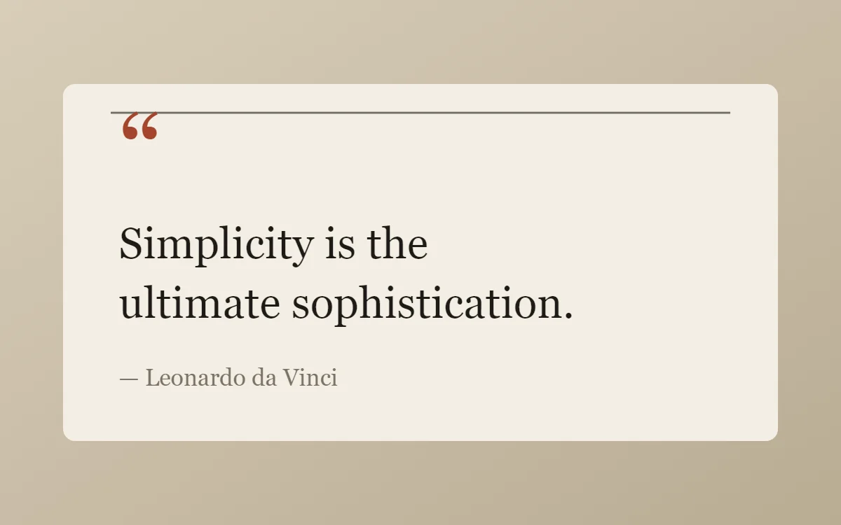
Use one typeface per widget, large for the main value and small for labels. Pick sans for clarity, serif for an editorial feel and mono for a technical look.
Start with one family
A widget is small, so one typeface is usually enough. Create hierarchy with size and weight: a large value, a small label. Two families can work when their jobs are clearly different, for example a serif headline with tiny sans captions.
What each family says
- Sans: neutral and clear. The safe choice for clocks, lists and numbers.
- Serif: editorial and warm. Good for quotes, dates and anything that should feel printed.
- Mono: technical. Digits are all the same width, so a clock does not shift as the time changes.
- Condensed: tall and narrow. Fits long numbers into small widgets and looks bold in capitals.
- Rounded: friendly and soft. Suits pastel and playful designs.
Size and spacing rules
- Keep labels at 10 points or more; smaller text is hard to read on a home screen.
- Make the main value at least three times the size of its label.
- Add a little letter spacing to capital labels, and remove a little from very large numerals.
- Limit text to two sizes plus the headline value.
Importing a font
WidgetCraft includes sans, serif, mono and condensed families with bold and italic. You can also import a font file to use in a widget. Free families from Google Fonts cover most looks: Nunito for soft designs, Poiret One for Art Deco, Press Start 2P for pixel art, JetBrains Mono for terminal styles and Playfair Display for editorial headlines.
An imported font is stored inside the widget, so the design still works after you share or back it up. Only use fonts whose licence allows it; open source families are the simplest choice.
Questions
What is the most readable font for a clock widget?
A sans or mono at medium weight. Thin weights look elegant but vanish on busy wallpapers.
Can I use more than one font in a widget?
Yes, but stop at two, and give each a clear job.