 WidgetCraftGet the app
Guide
Home screen layout ideas that stay tidy
Give each screen one job: a top widget for time and date, a middle widget for what is next and a single row of apps at the bottom.
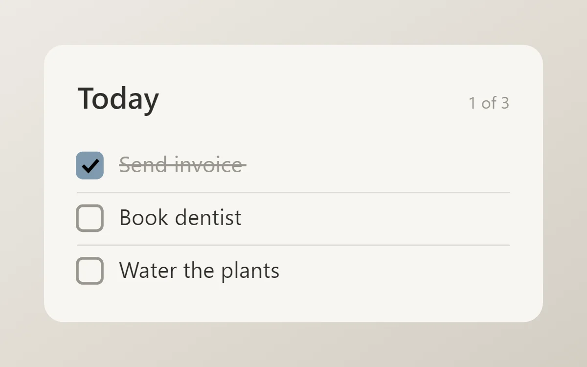
Five layouts that work
- Stack: a 4 × 2 clock at the top, a 4 × 2 list below it, then one row of apps. The easiest layout to keep tidy.
- Split: two 2 × 2 widgets side by side, such as battery and analog clock, above one 4 × 2.
- Hero: a single 4 × 4 photo or dashboard with nothing else but the dock.
- Edge: widgets at the top, apps at the bottom and empty space between so the wallpaper shows.
- One per page: a page for the day (clock, calendar, tasks) and a page for leisure (music, photo).
Rules that keep it tidy
- Leave at least one empty row on every page.
- Keep the same left and right margins for every widget; do not mix full-width and inset widgets.
- Put things you read at the top and things you tap at the bottom, where your thumb reaches.
- Limit each page to three widgets.
- Move rarely used apps to the app drawer or a folder.
Plan for your thumb
On a tall phone the top third of the screen is hard to reach with one hand. That makes it the right place for information you only look at, such as the clock. Controls you press, such as music buttons or checkboxes, are more comfortable in the lower half.
Questions
How many widgets is too many?
More than three on a page usually looks crowded. Add a second page instead.
Should widgets be the same width?
Yes, where possible. Equal widths create a clean column.