 WidgetCraftGet the app
Guide
A home screen setup for focus and productivity
Keep one page. Put the date and your next commitment at the top, today's three tasks in the middle and only the apps you need for work at the bottom.
The idea
Every time you unlock the phone, the home screen suggests what to do next. If it shows social apps, that is what you will open. If it shows your tasks and your next meeting, it nudges you back to the day. A productive setup is mostly about removal.
The layout
- Top: a small clock and date widget. You need the time; you do not need it to be large.
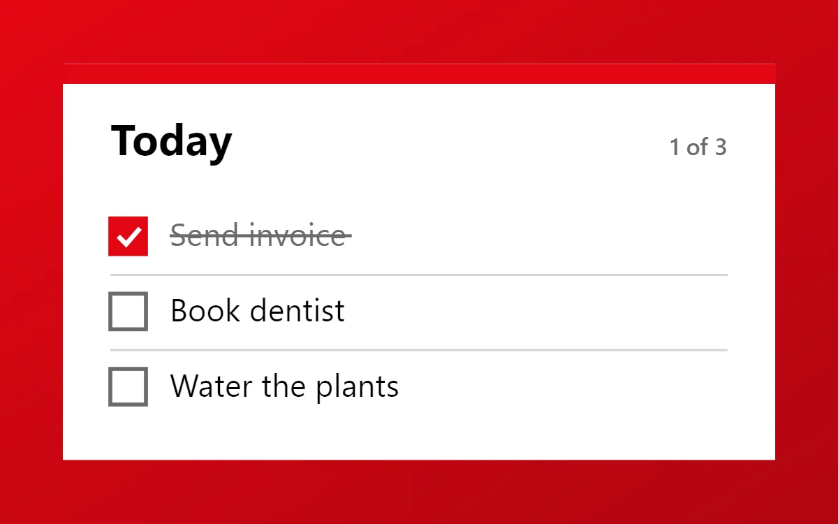
- Middle: a to-do widget limited to three tasks. Three is enough to be useful and few enough to finish.
- Below it: a year or day progress bar, or a countdown to your nearest deadline.
- Bottom: four to six apps you use for work. Nothing else.
What to remove
- Social, video and shopping apps. Move them to the app drawer so opening them takes a deliberate search.
- Notification dots, if your launcher lets you turn them off.
- Extra home screen pages. One page removes the habit of swiping to look for something to do.
Why a monochrome style helps
Color attracts attention. A black-and-white or single-color screen is calmer and makes the one accent you keep, such as today's unfinished task, stand out. Themed icons and a monochrome widget style get you most of the way.
Make the tasks tappable
A task list only works if ticking something off is effortless. In WidgetCraft, a list connected to local tasks can tick a row when you tap it on the home screen, without opening the app.
Questions
How many widgets should a focus screen have?
Two or three. More becomes a dashboard you stop reading.
Should I use a dark or light screen?
Whichever matches where you work. Dark is easier at night and on OLED screens; light reads better outdoors.